Showing posts with label colour. Show all posts

Friday, February 20, 2015

Origami postcard project ...

Hmmm ... been a while since I posted anything here ... here's what's on my desk this evening ...

Finishing up some postcards for a postcard swap, and using up what's on my desk, including a package of 2"x2" neon origami squares. They've been hanging around awhile and I thought it was time to turn them into art. I had no clear plan when I started these, just trusted that something would happen as I went along.

One thing that happened is that I kept wanting to add *more* stamping to fill in the emptyish bits. As in more stamping than I would normally do. I thought it might be fun to show you all the "steps" as they came to me. A few words about stamps ... I have a lot of them, but I tend to a) buy them on sale and b) not buy any set that doesn't have at least one stamp that I think I'll be able to use on multiple projects. It was kind of fun to "shop" through my stamp collection for just the perfect little thing.


For those who *really* want to know, here are the stamp sets I used ~ and just one stamp from each set.
Step 2: Stitching from Kelly Panacci / Sandy Lion's Clear Borders.
Step 3: Sun from Farm House Paper Company's Fair Skies Dusk.
Step 4: is from ... uh oh ... clear alphabet set I received as a gift ... not sure of the origin.
Step 5: Text Strip from Prima's Christina Renee My Rose set.
Step 6: Flourish from Penny Black's Dancing Deer set.

For those who know me, these are not the usual colours I work in ... but the contrast of the bright neon origami papers seemed to really need that crisp black in the stamps. These postcards are heading off to Tangie Baxter's Art Journal Emporium's postcard swap at the beginning of March ... good to have them done!

That's all for now ... planning to post some of my day to day journal pages soon. I've been re-inspired by seeing some other people's working journals and thinking it might be time to share ... more to come!


Sunday, August 10, 2014

Sketchbooks revisited ... part two: cover stories


Ever have those days when you're attracted to a particular colour palette? Brown kraft + black + white has always been my thing anyway, and it certainly doesn't hurt that the original covers on the Sketchbook Project Sketchbooks are that nice earthy brown to start with. In my own contributions to The Sketchbook Project, I've never been able to resist covering up everything with colour, but I find all the above covers unspeakably beautiful and oh so wish that I'd come up with them myself.

Left to right on the top row we have: Simple Beautiful Things by Staci Adman, Atlas of Turning 50 by Robin Matthews and Fox + Owl by Shawna Handke
Left to right on the bottom there's: i no longer feel the need to ask permission by kelly letky, untitled by therese murdza and untitled by artist unknown (sorry!).

Staci Adman's Simple Beautiful Things is all it says it is. I highly encourage you to look at the whole book online. I posted one of it's pages, Fall vs. Summer Honey, in my previous post, but truly every single page is quite, quite amazing and made me want to rush home immediately and journal all my little treasures with a similar care and magic. And notice the lovely little beads along the spine - simple AND beautiful!

Fox + Owl is a lovely work of torn text page collage and paint by Shawna Handke. Some pages are breathtakingly beautiful and it would be a tragedy if they weren't seen by more people, so go there now.

Kelly Letky's i no longer feel the need to ask permission is a great example of how to marry striking natural images with deep personal poetry. I felt like I was reading a work that ought to be published for a wider audience.

A picture may be worth a thousand words, but it barely begins to cover the tactile satisfaction of therese murdza's untitled. omg. I *so* did not want to let this book go. The combination of crunchy gesso, text page collages and simple mark making had me envious at first sight. Why oh why do I fill my sketchbooks with complex cerebral ideas when something like this is so gobsmackingly delicious?

I feel bad about not getting the info on the last book. Up to this point in the day I'd been studiously taking pictures of the back cover of each book, and noting whether or not it was digitized for your viewing pleasure, but I guess the sketchbooks were flying thick and fast and I didn't make a note of the author's name on this one, for which I am truly sorry. I tried finding it on the Sketchbook Project website, but either it wasn't digitized, or wasn't tagged with a searchable word. The book was a touching story of a woman whose mother chose medical denial for what was (by the author's judgement) a 98% treatable kind of cancer. It was a hard read in some ways ... but unable to talk to her mother about her hopes and frustrations, I like to think by telling all of us, she was letting go of things in her own beautiful way. I'll keep looking and see if I can find it online, but (ironically?) the odds aren't good.

Okey, dokey ... time for a little colour! Top left: Encyclopedia of Sharks - Part XI by Pascal Lecocq. Okay ... so Part XI isn't digitized, but some of his previous shark encyclopedias are. If sharks are your thing, I'd start with the first one, and then you can work your way through Parts 4, 5, 6, 7 and 8. You don't have to, and of course they're about more than sharks. I just loved his cover, so blue blue blue in a sea of brown (if you'll pardon the pun).

Top right is Atlas of My Dreams by Sonja NYC. I was immediately amazed by the use of thread on the Australian coast on the cover. I pretty much love anything that incorporates fiber in unexpected ways and this was beautifully done. The inner content never mentions Australia, instead it features Alice in Wonderland and sea creatures. Mysterious ...

Bottom left is Greetings from South Africa by Mieke van der Merwe ~ a cover (and book) that shouts it's beautiful detail from start to finish. I know very little about South Africa but this book's lovely colourful  line drawings and paintings of buildings, people, cameras and condiments (condiments?!) makes me want to go there.

Lastly, bottom right, is Map of the Table by Bonnie Hull. Now this is truly a case of not judging a book by its cover. I loved the cover right off ... triangular duct-tape snow-covered mountains, running along a duct-tape road, looking up to a fabulous blue duct-tape sky ... wonderful and tactile ... and absolutely no hint on the cover that inside there's a quirky string of simple line drawings of ... stuff on tables. A sense of the everyday  captured on various tables at various times ... tax time, breakfast time, meeting time, dinner time. I almost saved this one for my next post on fabulous inspiring line drawings, but since this post is about covers, the cover won out.

More next time ...

Monday, July 28, 2014

One for the bees ...

Just a brief little postette ... a bit of art I created over the weekend prompted by a challenge created by Effy Wild for her ning group. Say what you will, but sometimes having a jumping off point can be really satisfying when you're feeling creative but don't really have anything specific in mind.

I thought about "finding" a good bee quote to use as inspiration, but (as usual) the act of reading a bunch of bee quotes and not seeing one that grabbed me generated some writing of my own. When in doubt, use your own stuff, I always say.

The background is blueprint paper that's been gelli printed using my 6x6" gelli plate on Impression Obsession's plexiglass Mega Mount designed for their 6x6 Cover-a-Card rubber stamps. It's a cool quick way to get multiple layers of paint and texture on a big sheet of paper, and I just keep stamping and stamping till I figure that paper's had enough.

The bees are acetone image transfers. They come from Clipart, Etc, my favourite online resource for black and white images (historical, biological, etc etc). The flowers are from Stampin Up. There are a few random bits of collage and washi tape here and there.

The poem was created ransom-note style on scraps of paper using miscellaneous rubber stamp letters, rub-on letters and the ever-so-handy (but impossible to find at the moment?) Tim Holtz Label Letters. If I don't find more of these soon, I may need to make my own, which is a shame since I love the font (Dymo labeler!) and how each letter is already pre-cut. I created each word separately and then figured out the word spacing on the finished piece afterward.

Nothing too grand, but for some reason I really like it. It's funny (at least to me) that I'm always trying for "casual primitive" and wind up with "neatly organized". Think I'll just blame it on my Virgoness and learn to live with it.


Tuesday, March 12, 2013

Missing Artfest ...


As spring gets closer a part of my creative self is remembering this is the time of year (in past years) I'd  be getting ready for Artfest, which was hosted by Teesha and Tracy Moore and a crowd of volunteers. I'd be reading supply lists and gathering materials and thinking about how wonderful it is to gather with hundreds of like-minded artists for 5 intense days of learning and sharing. But (alas) Artfest is no more, so for this part of the process memories will have to do.

Oddly, what I miss most of all is making the trades. Given the population of Artfest (500+ artists), I took real pleasure in making small arty items to share with as many people as possible, and would often make something like 150 of whatever I'd decided to make, usually small books (quelle surprise!). I mean, how often in one's life (unless you're in manufacturing), do you get to sit down and make 150 of anything, particularly a small token of your creative self. Even now I find my fingers twitching to buy some little twiddle I've found in bulk with the idea that it would make an excellent start for trades at Artfest.

Fortunately for me, Artfest has brought some deep and wonderful friendships with other artists and I continue to meet (and retreat!) with them on a regular basis. It also introduced me to some fabulous teachers who I otherwise would only have known through their blogs. Like Roxanne Padgett for instance. It was in her class that I overcame almost all my colour fears. In fact, just looking at her artwork before I went to Artfest led me to Be Brave with Colour while making my Artfest Journal to take with me (as you can see by the front cover above).


And it was in her class more colour fears fell by the wayside as I created the portrait above. It's so completely different from anything I'd done before that I still can't believe I made it myself. I enjoyed her class immensely ~ from the warm up exercises that loosened us up, to the actual techniques of creation (this portrait was developed front to back on a sheet of plexiglass), to seeing the amazing variety of the work by all the other students. I've been eagerly awaiting her book "Acrylic Techniques in Mixed Media: Layer, Scribble, Stencil, Stamp coming out soon, and I'm *so* looking forward to it, although it won't be the same as having her right there encouraging me to *explore*, but it'll have to do.

My experience in her class, and in other Artfest classes have continued to feed and nurture my creative courage even today. So colour me bittersweet - missing Artfest, but loving where it got me.

Sunday, March 03, 2013

Gelli Plate Surprise ...


Yesterday I decided to have a little fun with my newly-acquired 8x10 Gelli Printing Plate. This may come as a surprise to some of my creative friends, but I'm a bit of a doofus around new tools. I've watched other people magically creating amazing stuff with ease, then I've rushed out enthusiastically to buy whatever miracle toy they were playing with ... only to find the stuff I create is ... a hopeless muddle.

I'm very happy to report that my experience with the Gelli Plate is *not* one of those times. As near as I can tell it may well be idiot proof (Exhibit A: the collage above). With a minimum of tools, a variety of acrylic paints (some new and luscious, some old and cranky), some leftover divider tab sheets and about an hour, I created a generous stack of deliberate experiments and gorgeous happy accidents.

So ... what did I love? Each print doesn't need much paint, so it's very economical. Think that "clean up" is a drag? Don't clean up till the end! Yes, you can change colours as you go. See that collage above? I only cleaned up at putting away time. Don't like the first print you pull? That's okay, set it aside and print over it a second, third or fourth time till it can't take it anymore and decides to be gorgeous for you. Think you hate the final result? Not so fast. See that mottled green on the bottom row? I really hated it when I pulled it, but looking closely at it later I decided it was very nice indeed. And did I mention the no clean up till the end thing? Oh yeah ...

So ... paints ... I used whatever I had on hand. Mostly random acrylics, although my friend Rose recently gave me some super sparkly Dick Blick Glitter Watercolours, and while their pigment wasn't strong, the sparkle is very cool (and that's from a person who usually shuns glitter). The more liquid your paint the more prints you'll get from each inking and the easier it is to spread it around, but even my less liquid paints were fine, just took a bit more time to brayer them on evenly. Whatever the paint is, the first pull is usually fine, and if the paint seems too dry for a second pull, just lightly mist the plate. The green dots on the middle square in the collage were from a misted pull, and I love how they turned out.

Tools I used: stencils, foam stamps, a little graining tool, the core from a roll of skotch tape, a rubber brayer and a spritzy water bottle. I also taped a length of freezer paper to my table before I started - the Gelli Plate contains mineral oil, so it needs to be on something so you don't mark your table. Some people use a piece of glass or a teflon sheet. This also helps you if you want to rotate the plate while you're using it.

My other essential item (gleaned from watching various gelli vids on the net) is something to roll your brayer on after you've inked the plate. My choice of was an outdated copy of Leonard Maltin's movie guide. Let's face it, there's nothing more out of a date than a 20-year-old book of movie reviews. I suppose I could have torn out the pages and rolled on them, but I decided to just roll and turn the page. I figure I can throw it in my bag and take it to collage parties.

The table (post clean up). Poor Leonard! His reviews were never this colourful.

Well ... that's about it ... I just signed up for Carolyn Dube's Colorful Gelli Printing Workshop. I've been watching all the wonderful videos on her blog and I love her enthusiasm. In her last post she gelli'd her freakin' shoes (!). I'm looking forward to learning a ton more fun stuff to do with my Gelli Plate. I mean, if this is what I can create in an hour with *no real* knowledge, just imagine how far from a hopeless muddle I'll be with a little more practice.

Saturday, June 09, 2012

Caran d'Ache, Watercolours and Other Stuff ...

In my last post I mentioned that I'd discovered a new way to use Caran d'Ache water-soluble crayons as watercolours, so I thought while I'm at it, I might as well show you my *new* portable art kit that I've put together. As my friends have heard me say (perhaps a little too often?), if I'd known how much I was going to love these crayons I would've bought the big box. I bought a set of 30 while at Artfest a few years back, and even though they were on sale, and the store was giving Artfest attendees a further discount, I still hesitated. It's not that I didn't think they were worth it, but I already have way too many art supplies that "other people love" only to find that I can't make them do interesting things in my hands. My problem, not theirs. Anywho ...

For the first three years of their lives, my Caran d'Ache sat in a neatly spectrumized row in their original tin, and then one day I needed to do a background, and the most efficient way to do it was by breaking a crayon  (gasp!) and using it on its side. I paused, thought about it, and then, ceremoniously, broke my first crayon. And then I broke them all, one after one. And I lived. I know that might sound weird, but I'm funny about keeping things pristine in the package, just in case, oh I don't know, I get audited by the Art Police or something (I didn't say it was logical). Two things happened after that ... every trip to Port Townsend and Akamai Arts led me to buying more Caran d'Ache, and I moved my little half-crayons to a lovely thin little tin (less prone to coming open and spilling and all that sort of un-Virgo stuff). But (and you saw this coming, didn't you?) one day, even broken in half, I'd bought so many new colours that they could no longer fit in the lovely little tin. Uh oh. I graduated to a larger tin, and the new tin had room for Other Stuff. This is the story of the Other Stuff, and how, at our last retreat, I discovered I might actually *like* watercolour painting, something which has mystified (and possibly terrified) me for years. 

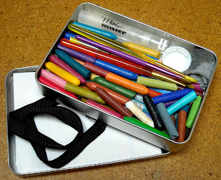
So ... left to right in the photo ... elastic hairband (more about that later), Mini Mister, scribbles of Caran d'Ache on label backing sheet, bit of old t-shirt (don't tell Mr. B.), dollar store paintbrush (cut to fit in tin), pop bottle cap, the Caran d'Ache I scribbled with, and the traveling tin. Oh, and the artwork? More on that later. It's taken about a year to perfect this little traveling kit. All packed up it measures 6.5" x 4.5" by 1", and is in fact, an old Maya Road tin I got years ago, its contents long gone. I've never been one of those people who likes BIG containers of water when I paint ~ too many opportunities for tragedy to my mind (hmmm ... must be the Virgo thing again). I prefer pouring a little water from the Mini Mister into a pop bottle cap, and cleaning my brush on the t-shirt scrap, or (truth be told) on the back of my hand (I know, I know, I'm a symphony of contradictions). But then I've never been the kind of person who slathers on acres of acrylic paint either, which would require the large pot of water and the Big Brushes.

Finding out that certain label backing sheets make excellent palettes was another bonus. Oh yes, I know, it *sounds* logical, but I discovered that not all label backing sheets are equal. Some are so slick that you can't scribble the crayons on them and that's no good either. Also (and quite coincidentally), a standard label backing sheet folded (or cut) in quarters, neatly fits in the Maya tin, too. Double bonus. The elastic headband holds the whole tin together because heaven knows it was *no good* at keeping my hair in place when I wore it. I think I must have a spherical head. But that's a discussion for another day.


Here's everything packed up to go ... the bit of damp T-shirt is rolled and tucked away so the wet is well away from the water-soluble crayons and the now dry bottle cap and the mini mister make sure it stays that way. The label backing sheet has been wiped clean of any residue and is folded in quarters ready to lay on top of the crayons and the little brushes, and the elastic headband waits to wrap it all up. The headband goes around the tin twice by the way, which is perfect when I want to elastic the tin to my journal for traveling.
Well, that's about it ... unless you were hanging around to see the artwork, in which case ...

These are my first attempts at illustrating somebody else's words ... in this case, the song "Parkette" by Bob Snider. I could rave on here about Bob Snider for awhile, and you'd probably understand him better by listening to him, but he's amazingly elusive online, which fits somehow with his persona. My first encounter with him was years ago when I was volunteering on the Admin Committee at the Vancouver Folk Music Festival. A couple of us spent some time trying to track him down for a scheduled performance only to discover later that he'd been busking in the downtown eastside. I'm no musical expert, but I don't think I would describe his playing as dazzling or virtuoso. In fact, his style of playing and his banter are so warm and casual and understated that it's only about halfway through the song you realize your heart has been sucker-punched (in the best way possible) by his lyrics. "Parkette" is one of my favourite little nuggets of his work, a brief 1 minute and 40 seconds. The pages are not in order in my painting, in case you're wondering why it doesn't make sense ~ and I'm only show you half, since the final project will be printed back-to-back. When I say "printed" I'm being optimistic. I thought when I got inspired to paint his lyrics that it'd be an easy thing to contact him and get permission to create and print my little book, but as I say, he's darned elusive online, and I've yet to get through to someone who can ask him if it's cool with him that I've created this. But when I do get through, and if he gives the okay, there may be a minizine in the making. But, in the meantime, I've definitely gotten over my irrational fear of watercolours.

Monday, April 25, 2011

Artfest 2011 - Part 2

More on my adventures at Artfest ... this episode: too much fun with paint!

My first day's class was Roxanne Padgett's Lush Layered Canvas. I'd taken a class with Roxanne at Journalfest, so I had an inkling (paintling?) of what was coming, but I knew I had SO much more to learn from her. Like how not to be so timid with colours. Okay, I'm still timid, but it's not her fault ~ it's just going to take a few more whacks on the brain to make me more adventurous.

The first thing she had us do was paint a colour wheel, and you know in all the exposure I've had to art, art classes, art teachers and art supplies, I've never actually sat down and made a colour wheel before, and I gotta say - it was a treat. Yes, yes, of *course* I know the primaries, and the secondaries and even the tertiaries, and how it only takes a little bit of dark to significantly alter a whole bunch of light, but doing it was very instructive all the same. Roxanne's advice ("How *not* to make mud") was perhaps the most useful of all, since making mud is the thing that usually scares me away from playing with paint in the first place. We also learned about tints, shades and complements - the stuff that we all think we know about ~ and then you sit down and do it and you see it in a fresh way.

We worked on four pieces at once ... canvas, linen, bottom weight (no snickering out there!) and just your average pre-printed cotton. I eschewed the pre-printed cotton (which was too beautiful to paint on ~ sorry, Roxanne!), and opted to make my fourth piece on paper. Funnily enough, I think I like the paper one best of all. Probably because I chose colours near and dear to me (the colour coward wins again!). Anyway, that's the one I've shown you above. Our basic modus operandi was to start with broad strokes on the bottom layer, and work our way up to more and more detailed layers as we went. We moved from piece to piece, letting each successive layer dry as we did so ... by the time I finished layer one on the last piece, the paint on the first piece had dried enough to move on to layer two, etc etc.

I *did* try to coax the colour coward out of the box, but the results were (to my mind) so atrocious it's one of the few times I wished I could turn back time so I could *undo* my work and go back to the step before when I'd really, really, really liked the piece. Oddly enough, this is the piece (other) people seem to respond most positively to, so obviously I am *no* judge of anything. And no, I'm *not* going to show you that one. Well, not right now ... maybe after I stop sulking and trying to turn back time. This negative turn of events made me chicken out of finishing one of the other pieces, since I knew I was on the verge of Doing Something Undoable That I Might Regret to it and I wanted to think about it a bit before I did that. So that's why I'm not showing you that one either.

I blame *none* of this on Roxanne, who is an amazing and generous teacher. When I'd taken her class at Journalfest I spent most of my time muttering things like: brilliant!, why didn't I think of that? and OMG (in a good way). This time I resolved to a) take better notes, and b) take lots of photos, both of which I'm happy to say I did. I came home fired up to cut my own stencils! use paper plate palettes that become art in themselves! and never waste paint!

So far, I cut two stencils in class: an anatomical heart (loosely based on one of Roxanne's own stencils) and a rowboat, and since I got home I've been experimenting with a woodburning knife to *cut* my own stencils in acetate ~ hey, it works! Instead of paper plates, I've opted to use file folders for palettes (I have like 200 of them and they lay flat, and I can use their random painty goodness in future zines!). And I've been smudging, stenciling and stamping my about-to-be-leftover paint onto already-leftover bits of canvas lying about the studio. Cool ~ looks like I actually learned something.

The dress stencil I used on the piece above is one of Roxanne's own multi-step designs, and she has a *wealth* of ideas about stencils ~ commercially-available, cut-your-own, stuff that was never intended to be used as stencils, you name it ... she's made me aware that I should keep my eyes open at *all* times for hidden pattern and texture opportunities. I'd highly recommend anyone interested in this sort of stuff take a class with Roxanne - she's the bomb.