Showing posts with label books. Show all posts

Sunday, June 14, 2015

On how we never know what will work ...

There are people (I hear) who use blogs for promotion. As you can probably tell by the frequency and tone of mine, that's never really been the point for me. When you get down to the bare bones, I'm not really sure why I blog. I know I have a few lovely friends out there in the world who read me (you know who you are, right?) but I've never sought to bulk up my followers list, or getting insanely rich from my creative endeavours (as if!). But despite my lack of any dedicated action in that direction, I seem to have stumbled into print lately, and I thought some of you might like to know ...

Mr. B., who is naturally cynical, is wary of situations where someone (particularly someone who doesn't actually *know* you) appears to be doing something to "make you famous". His main criteria is whether or not you PAY to be published. He therefore does not count any of my contributions to The Sketchbook Project, where I paid a fee to have my books digitized and posted online. He's right, of course. I could've literally stomped on each page with a muddy boot, send them the money and *voila!* ~ famous online!

I would argue (in my favour) that I *could* have done that ... but didn't. Each Sketchbook Project book was patiently created by hand (twice ~ since I always make one for myself), and with perhaps a little reservation about this year's book (not my best), I'm pretty pleased with the results. And (as much for my own convenience as anyone else's) here's the list:

Time Traveller, Builder of Bridges, The Science of Story, today i am inspired by ..., and lastly, this year's contribution: the sum of one's parts. If I'm a little less pleased with this year's effort, it's only because I was *so* going in a different direction when I started, and had to start again when my first *genius* idea hit a fork in the creative road. I know I will get back to it when I figure out how to bring it to fruition. All I can say is watch this space ... eventually.

So, apart from paying to be famous (can you say vanity press?), there are the other kinds of being published, and I've been lucky enough to have two (2!) recent appearances in bona fide actual published books that other people can buy on Amazon (surely, Mr. B., *this* qualifies!).

The first is:
Art Journal Kickstarter
Edited by Kristy Conlin

One of my favourite journal spreads  from La Musee d'une Vie Inventee appears on page 20.

As it's one of my favourites, it'll be no surprise to find I've already talked about here on the blog:

My second appearance is:
A World of Art Journal Pages
Edited by Dawn DeVries Sokol


I've got two pages in this one on page 42, (or maybe a double spread counts as three?). One of them again a favourite. The other not so much. Not that I don't like it (I do), but of all the pages I submitted, I didn't think it was the best, or even one of the best ~ I threw it in for variety! Which leads me to my point: it's really hard to know what other people will like.


And if you don't know what other people will like, there's really no point in trying to please other people artwise. The best thing to do is what *you* like, and if you keep doing what you love often enough, eventually you'll get mad skills, have gobs of followers and be made insanely rich as everyone clamours to publish you everywhere. The last part of that sentence was a test, by the way ... all you really want are mad skills and to be able to do what you love. Well ... that's all I really want. You can want fame and fortune, too ...  if you like. Wink.

And a big shout out to all those folks I know who also appear in these books ... a surprisingly long list of  dear friends, people I've taken art classes with and people I've been taught art by.  I never imagined we'd be in print together ... my dreams are humble. I'm sure Mr. B would approve.

Sunday, March 22, 2015

Journal Experiment - Jan 15 to Jan 27

Wait? January? Yes ... because I'm posting these pages sequentially, and waiting till they ripen on the page, i.e. till I've had enough distance from them that I feel comfortable posting them. Today three more pages, when I was just getting the hang of doing them regularly. I'm creating them faster now, so the speed should increase as time passes. Or words to that effect. Here we go:

And the inevitable notes:
Page 1: Jan 15
~ Photo of Barbie feet from a zine I did on anatomy. When I was a child I thought you'd know you were "grown up" when your feet took on this shape. Yep, pretty naive.
~ Page from Scavenger by Seth Fitts, who I discovered at the Sketchbook Project when it was on tour in Vancouver one year. I can't tell you how happy I am when looking at his work. Well, I could, but it might be a little awkward for both of us. You can find more of his amazing work here as well. He's up there with Shaun Tan, Nick Bantock and Joseph Cornell in my own personal artist/star rating system.
~ Child's drawing? No idea whose... came to me in some stuff to use in collage. Probably from my friend Rose who brings me little delights to add to my journals. She knows me so well.

Page 2: Jan 19
~ Random jottings, all me I'm afraid.
~ Save the Humans photo clipped from the newspaper. Taken at the BC Parliament building in Victoria. No idea when ... or by who ... just saved the photo.
~ Rules for Public Library (circa 1930's?) ... another gem from Rose.

Page 3: Jan 23-27
~ 7 books for Downtown Abbey addicts. Heard on the radio, probably CBC. I'd already read The Buccaneers (suggested by Mr. B's Mum years ago and I loved it). Since I enjoy Fay Weldon, I think Habits of the House will be the next likely read.
~ Child Motion Development from a Russian Health Encyclopedia I acquired somewhere. I particularly love Figure 11 (bottom right corner), although I can't say why.
~ Knitted polar bear sweater which is unraveling ... as seen in the building I work in as a GIANT poster, so I went to the Admin office and asked if they had it as a smaller format, which they did. I thought it was the perfect marriage of concepts ... wearing a sweater instead of turning up the furnace, which uses energy which creates global warming which means the ice floes the polar bears depend on are melting/unraveling ... genius. Wish I'd thought of it (or a similarly clever concept).
~ DIY reusable gelli plate ... if you are a gelli plate person and haven't looked at Linda Germain's Printmaking Without a Press blog, you really should. I'm just sayin'.
~ Cube books in a box ... an idea in progress. I mention a class with Roxanne Padgett, one of the top three teachers I ever had at Artfest (which I *still* miss!). She's AMAZING (yes, I'm shouting that). Go look at her stuff here.

It occurs to me it's no bad thing that I'm annotating my journal with online notes here ... like having my actual journal be hyperlinked and searchable for myself. Such a good idea ... so glad I thought of it.

Friday, November 21, 2014

The evolution of a project ...

Last September I wrote about the evolution of an idea. Today's post is about how a project grew from seeing something that piqued my creative curiosity to hosting a collaborative project inspired by it and eventually developing a teachable class.


It started with this: London, A Three-Dimensional Expanding City Skyline by Sarah McMenemy. I found this book (surprise!) in London. There was something so lovely about it  - how it folded out so big (over three feet long when extended) and condensed to something so small (just over 4" x 4.5"). And then there's the colours, the sights featured (been there! done that!), the die cut skyline, the extra pop-up bits - yum! Looking this up on Amazon I see she's done other locations as well: Paris, New York, Berlin, the Metropolitan Museum of Art (oh my!).

When I got  home I put it away, as one often does with the little treasures of travel, but it popped into my mind 6 months ago while looking for the next collaborative for the Vancouver Artist Card Group (of which I am the humble organizer). I organize 2-3 collaboratives a year for the group ~ I think it would be shame to have a group of creatives together and not *do* something. So I took out the expanding London and tried to condense it (if you will pardon the pun) into something a group could manage, and something I could create instructions for. Then I created a prototype, which looked like this:


I thought it looked like a fun and do-able group project. I particularly enjoyed creating the backs of the houses with bicycles and recycling bins, as you can see above. So ... I created a set of instructions, a set of templates for possible house shapes and went off to the next ATC group meeting with sign-up sheet in hand. I had a good response from the group, and (as I was hoping) they got creative in a whole bunch of ways ~ from houses with onion-shaped roofs, to cars in the driveway and lots of other little details. Here's the collaborative village ...

One day, I was chatting with Sue Farrant, who hosts the Paper Angels Art Retreat twice a year, and she asked me what I'd been up to and I dug out the Accordion Village collaborative and she got this twinkle in her eye and said: How would you feel about developing this into a class for the next retreat? She told me Stampin' Up had a new set of stamps and dies in house shapes that would be perfect for this. I hesitated a little. It's been awhile since I taught an actual "class". I mean, I teach *all the time* at the ATC group, but it's just chatting with friends, so there's not much pressure. Then she showed me the paper she had in mind for the project and it was so deliciously wintery without being Christmassy (long story) that I pretty much had to go for it. And so I did (how's that for condensing a very long story into a very short one? Lol).

And here's the result ...
I taught the class at the November Paper Angels Retreat, and I'm very pleased to say that all ten students left with something looking very much like the prototype ... each with their own individual twist on decoration, mind you, which is another concern I had ... I'm all about everyone finding their voice and while I knew the important thing was to teach the structure (accordion book), I *really* wanted them to see how flexible this project is when it comes to personal taste. The stamp set itself is *very* flexible. In fact, the weekend before the retreat, on Hallowe'en night (we have zero trick-or-treaters in our neighbourhood, so I was completely undisturbed) I made a Hallowe'en version:
The stamp set not only has wintery and Christmassy things, it also has bats, a ghost and spidery cobweb.  A simple change of paper colours, and the whole thing looks completely different. For the Hallowe'en village I made backs for the houses using what I call my "brayer layers" ~ the leftovers where I clean my brayer on Reader's Digest text pages while playing with my Gelli plate. In my studio nothing goes to waste! And the die cuts made it easy to do ~ no fussy cutting of shapes ~ bonus!

So, there you are ... from inspiration to collaboration to instruction in three steps. And for those of you who're interested ... I created a 12-page full-colour step-by-step instruction book for the project, and I've also got Winter Village kits using the same papers we used in the class (as shown in the Winter Village photos above). The kits have everything pre-stamped and pre-cut, and include all the trimmings so you can make your own winter village. The books by themselves are $10 and the totally ready-to-go kits (including a book) are $25, postage included. Just send me an email and let me know if you're interested.

And that whole teaching thing? Yep ... guess I'll be doing more of that ... there's another Paper Angels retreat coming up in the spring, and if Sue asks me ... I've already got ideas dancing in my head ... you might want to watch this blog for more info ...

Sunday, August 10, 2014

Sketchbooks revisited ... part two: cover stories


Ever have those days when you're attracted to a particular colour palette? Brown kraft + black + white has always been my thing anyway, and it certainly doesn't hurt that the original covers on the Sketchbook Project Sketchbooks are that nice earthy brown to start with. In my own contributions to The Sketchbook Project, I've never been able to resist covering up everything with colour, but I find all the above covers unspeakably beautiful and oh so wish that I'd come up with them myself.

Left to right on the top row we have: Simple Beautiful Things by Staci Adman, Atlas of Turning 50 by Robin Matthews and Fox + Owl by Shawna Handke
Left to right on the bottom there's: i no longer feel the need to ask permission by kelly letky, untitled by therese murdza and untitled by artist unknown (sorry!).

Staci Adman's Simple Beautiful Things is all it says it is. I highly encourage you to look at the whole book online. I posted one of it's pages, Fall vs. Summer Honey, in my previous post, but truly every single page is quite, quite amazing and made me want to rush home immediately and journal all my little treasures with a similar care and magic. And notice the lovely little beads along the spine - simple AND beautiful!

Fox + Owl is a lovely work of torn text page collage and paint by Shawna Handke. Some pages are breathtakingly beautiful and it would be a tragedy if they weren't seen by more people, so go there now.

Kelly Letky's i no longer feel the need to ask permission is a great example of how to marry striking natural images with deep personal poetry. I felt like I was reading a work that ought to be published for a wider audience.

A picture may be worth a thousand words, but it barely begins to cover the tactile satisfaction of therese murdza's untitled. omg. I *so* did not want to let this book go. The combination of crunchy gesso, text page collages and simple mark making had me envious at first sight. Why oh why do I fill my sketchbooks with complex cerebral ideas when something like this is so gobsmackingly delicious?

I feel bad about not getting the info on the last book. Up to this point in the day I'd been studiously taking pictures of the back cover of each book, and noting whether or not it was digitized for your viewing pleasure, but I guess the sketchbooks were flying thick and fast and I didn't make a note of the author's name on this one, for which I am truly sorry. I tried finding it on the Sketchbook Project website, but either it wasn't digitized, or wasn't tagged with a searchable word. The book was a touching story of a woman whose mother chose medical denial for what was (by the author's judgement) a 98% treatable kind of cancer. It was a hard read in some ways ... but unable to talk to her mother about her hopes and frustrations, I like to think by telling all of us, she was letting go of things in her own beautiful way. I'll keep looking and see if I can find it online, but (ironically?) the odds aren't good.

Okey, dokey ... time for a little colour! Top left: Encyclopedia of Sharks - Part XI by Pascal Lecocq. Okay ... so Part XI isn't digitized, but some of his previous shark encyclopedias are. If sharks are your thing, I'd start with the first one, and then you can work your way through Parts 4, 5, 6, 7 and 8. You don't have to, and of course they're about more than sharks. I just loved his cover, so blue blue blue in a sea of brown (if you'll pardon the pun).

Top right is Atlas of My Dreams by Sonja NYC. I was immediately amazed by the use of thread on the Australian coast on the cover. I pretty much love anything that incorporates fiber in unexpected ways and this was beautifully done. The inner content never mentions Australia, instead it features Alice in Wonderland and sea creatures. Mysterious ...

Bottom left is Greetings from South Africa by Mieke van der Merwe ~ a cover (and book) that shouts it's beautiful detail from start to finish. I know very little about South Africa but this book's lovely colourful  line drawings and paintings of buildings, people, cameras and condiments (condiments?!) makes me want to go there.

Lastly, bottom right, is Map of the Table by Bonnie Hull. Now this is truly a case of not judging a book by its cover. I loved the cover right off ... triangular duct-tape snow-covered mountains, running along a duct-tape road, looking up to a fabulous blue duct-tape sky ... wonderful and tactile ... and absolutely no hint on the cover that inside there's a quirky string of simple line drawings of ... stuff on tables. A sense of the everyday  captured on various tables at various times ... tax time, breakfast time, meeting time, dinner time. I almost saved this one for my next post on fabulous inspiring line drawings, but since this post is about covers, the cover won out.

More next time ...

Wednesday, March 19, 2014

Just a little Wes-obsessed at the moment ...

I realize it's been ages since I posted anything here. Not that I haven't been creating, I've just haven't been talking about it. I've been creating plenty, including this page, which is one of my submissions for Owen Clements wonderful kickstarter project: Wes Anderzine!

I'm a relative newcomer to Wes Anderson movies, but I'm just a teeny bit obsessed with them at the moment. I think that might be normal if you like his movies. I never quite know how to describe them to people who haven't seen them. Quirky is apt, but it barely scratches the surface. They're like quirky to the nth degree. They satisfy on so many levels it's almost an overload on the senses. You can watch the first time for the story, then again for the characters, then again for the dialogue, then again for the colours, then again for the design details, and documents, and aerial views, and camera pans, and music, and well, you get the drift ... it's like trying to pick your favourite part of a kaleidoscope as it changes before your eyes.

The artwork above is inspired by Suzi in Moonrise Kingdom, my favourite Wes Anderson movie so far. Suzi and Sam are perhaps the sweetest, quasi-tragic pair of star-crossed not-quite-old-enough-to-be lovers I've seen on screen since Zeffirelli's Romeo and Juliet (but with a happier ending). I could go on about the movie for awhile, but it's like trying to pin down mercury - so I won't. But any movie that features a library book obsessed, binocular wearing, scissor wielding, misunderstood preteen heroine is already leaps and bounds ahead of most Hollywood-generated blockbusters as far as I'm concerned.

Like Suzi, I'm a little book-obsessed myself, and one of my favourite non-parts of Moonrise Kingdom is this little gem of a video book review with The Narrator. Do you like to read?

As a kickstarter backer, as well as a contributor, I'm eagerly awaiting my very own copy of Wes Anderzine, Volume 2 to arrive from England. Congrats to Owen for hosting such an amazing project and for letting all us wesandergeeks contribute. I heart collaboratives, and the quirkier, the better. Looking forward to seeing more Wes Anderson movies so I can contribute to Volume 3.

Tuesday, July 09, 2013

Recent adventures in art : giving books the eyeball ...

Left: "Temptation". Right "Dragon Watch"
One evening last week my friend Tammy dropped by with some new fun art material to play with. She'd recently taken a class creating "eyeball" books and thought I might enjoy making one for myself. She was oh so right.

In my opinion, you can always tell a good art material by how much it bends to the artist's vision. And in this case, I didn't so much have a vision as a hunch. Well, actually not so much a hunch as a willingness to see what popped up when I started playing. The base books are quite small and very very cheap. Like dollar store cheap. The sculpting material is apoxie clay ~ the jar A + jar B = hardens in air over the course of a couple of hours kind of clay. Not cheap, but definitely worth it.

"Dragon Watch" on the right measures 3.75" x 5.4" and was the first book I made. Wish I'd had the forethought to take pictures before I started, but I'm a *little* impatient when I get an idea. The original cover was matte black with big bright glossy flowers. You'd never know that now, of course.

After mixing A+B, I spread a thin layer completely over the front of the book, paying particular attention to those glossy flowers. I wasn't sure the apoxie would stick to them, but it held on marvelously. The focal point (no pun intended) is the eye. I dug through my random art supplies and found this beautiful clear sea green marble, and started layering bits of apoxie around it to form the eyelids and brow ridge. Almost immediately the marble seemed to turn black (no light shining through anymore - d'uh!). Ah well, live and learn, I figured. Once I had the eyeball in place, I began rolling small balls of apoxie clay and layering them around the eye in what seemed like a "natural" way. I resisted the urge to google lizards to see what I should be doing. I'm stubborn that way. As time passed, the apoxie was getting stiffer and stiffer, so it's a good thing my "hunch" wasn't too ambitious. The interesting thing for me was how lifelike it all turned out. Even before it was painted the eye just sort of looks at you. It's a little creepy, but in a good way, I guess.

The next day I (again!) didn't take a picture before painting. Just too impatient to get started. I decided to gesso the whole thing (front and back cover) to cover up the rest of the bright glossy flowers on the back, then I gave the whole thing an undercoat of purple. I know. Dragons aren't purple. But I wanted to get some layers in there and, following another hunch, purple seemed like the right colour. When that was dry I overpainted with Chromium Green, then rubbed off some of it to let some purple show through, and then lightly brushed the high areas with iridescent turquoise. The last step (which I have yet to do) is to find a nice bit of red ribbon to replace the current bookmark, so Dragon Watch will have a tongue! And the thing about the green-marble-now-turned-black is that in certain lights, you get a reflection from deep in the eye that makes you *really* feel like the book is looking back. Cool.

I had a bit of leftover apoxie mixed up (once you've mixed A+B together, there's no going back and apparently creating a dragon takes less clay than you think) so I decided to use it up on a second book.

The second book, "Temptation" (on the left) is a mere 3" x 4.25". I loved the little fabric circle on the front so much that I didn't want to cover it, and as I was rolling out the remaining apoxie into a "snake" of clay it occurred to me that I could indeed make a snake and have it curl around the circle. I'll confess right now that at this point I should have googled snakes to see what they look like (I'm pretty sure their heads look *nothing* like what I made), but the apoxie was getting stiffer by the minute and I just went for it. I had just the teeniest bit of leftover after I made the snake, so I thought I'd add one more little detail ... which turned out to be an apple. I wish I could say I'm clever enough to think of these things ahead of time ... oh yeah, I *totally* planned for a snake and an apple, but no ... I just wung it. (Wung it, as in past tense of "to wing it").

When the snake was down I was seriously impressed with how firmly the whole thing was stuck to the book. Even before it was dry I simply could not budge it. I made a diamond back pattern with my book-making awl (don't tell my book binding kit!), and then poked a series of holes that I thought I would glue beads into after painting, and a hole in the top of the apple for a stem of twisted wire, and a leaf of painted text paper sandwiched around some strong baling wire. The next morning I painted the snake with iridescent green and turquoise, and the apple in quinacridone red. Getting the beads in the holes was easy. Keeping them there was a whole other deal. You try sticking sticky beads in sticky holes with sticky fingers and get back to me. I eventually wound up using a pair of toothpicks as chopsticks, and then overpainted the whole thing with a layer of glue just to be safe. I was worried the glue would dull the iridescent paints, but it looks fine, and the beads are well and truly stuck. Phew!

Tuesday, March 12, 2013

Missing Artfest ...


As spring gets closer a part of my creative self is remembering this is the time of year (in past years) I'd  be getting ready for Artfest, which was hosted by Teesha and Tracy Moore and a crowd of volunteers. I'd be reading supply lists and gathering materials and thinking about how wonderful it is to gather with hundreds of like-minded artists for 5 intense days of learning and sharing. But (alas) Artfest is no more, so for this part of the process memories will have to do.

Oddly, what I miss most of all is making the trades. Given the population of Artfest (500+ artists), I took real pleasure in making small arty items to share with as many people as possible, and would often make something like 150 of whatever I'd decided to make, usually small books (quelle surprise!). I mean, how often in one's life (unless you're in manufacturing), do you get to sit down and make 150 of anything, particularly a small token of your creative self. Even now I find my fingers twitching to buy some little twiddle I've found in bulk with the idea that it would make an excellent start for trades at Artfest.

Fortunately for me, Artfest has brought some deep and wonderful friendships with other artists and I continue to meet (and retreat!) with them on a regular basis. It also introduced me to some fabulous teachers who I otherwise would only have known through their blogs. Like Roxanne Padgett for instance. It was in her class that I overcame almost all my colour fears. In fact, just looking at her artwork before I went to Artfest led me to Be Brave with Colour while making my Artfest Journal to take with me (as you can see by the front cover above).


And it was in her class more colour fears fell by the wayside as I created the portrait above. It's so completely different from anything I'd done before that I still can't believe I made it myself. I enjoyed her class immensely ~ from the warm up exercises that loosened us up, to the actual techniques of creation (this portrait was developed front to back on a sheet of plexiglass), to seeing the amazing variety of the work by all the other students. I've been eagerly awaiting her book "Acrylic Techniques in Mixed Media: Layer, Scribble, Stencil, Stamp coming out soon, and I'm *so* looking forward to it, although it won't be the same as having her right there encouraging me to *explore*, but it'll have to do.

My experience in her class, and in other Artfest classes have continued to feed and nurture my creative courage even today. So colour me bittersweet - missing Artfest, but loving where it got me.

Friday, March 01, 2013

Looking back at our shadow selves ...


Today's post is a page from the Time Traveler book I contributed to the Sketchbook Project back in 2012. I was thinking the other day about how long an idea can stay with you before it finally surfaces in the form of art and/or writing.

The first time I thought about shadow selves was about 30 years ago ... my 22-year-old self was having lunch with a group of friends in a hotel restaurant in the town I grew up in, but where I hadn't lived since I was 12. We'd driven 125 miles, from the town we all currently lived in, to consider renting a house together in this new location, and I hadn't told anyone that I'd once lived here.

Through the restaurant window I could see the elementary school my 8-year-old self had attended. Since it was lunch time, the school field was alive with active, noisy children playing games that probably hadn't changed much since I'd been out on that field myself. It was like looking back in time, and what came to mind was a particular sports day when (not being athletic) my 8-year-old self volunteered to help the teachers organizing and handing out ribbons and water and bandaids. I remembered the day very well, and at lunch time on that day, I'd been sitting at a table putting ribbons in order, facing the very restaurant my 22-year-old self would someday be sitting in.

And if that wasn't odd enough, my 12-year-old self had taken music lessons in one of the hotel meeting rooms, so now there were three of my shadow selves, all within easy reach of each other. Even at 22, my awareness of this overlapping of shadow selves made an impression on me.

The second time I thought about shadow selves was while traveling in New Brunswick in my mid-30's. I'd made a trip back east to meet my parents' families, and at one point was traveling by bus from one small town to another. I was dropped off at the pickup point (a gas station) to wait for a bus that might be along in anywhere from 20 minutes to an hour. It was a pleasant sunny day, and the gas station had provided a comfy, sheltered bench outside for waiting passengers. I did what I always do in times like these ~ I took out my journal. I started writing about the people and places I'd seen so far, and a half hour later the bus came and I got on board. If there's one thing I learned 'back east', it's that hurry is not in the vocabulary. The bus was not in a hurry to get on the road ~ we were there for at least another half hour. In that time, other people arrived and boarded, and I continued writing. From my seat in the bus I could see the bench I'd been waiting on, and I saw myself there, on the bench writing, and I was now, on the bus writing. I was thinking how unlikely it was that I was there at all (so far from home in BC) about how insubstantial all these past selves are, and since I was writing, I wrote about it, mentioning not only that current experience, but looking back on my 22-year-old awareness of it as well.

Fast forward another 20 years, and in my journal I'm making page after page of notes for the Time Traveler project, realizing we all travel in time, we just do it one day at a time. And in every second we leave ghost imprints of ourselves wherever we go. I was thinking about this: where are we most solid and what does this tell us about ourselves? What can we learn from where my shadow selves have been? Can we go back there and relive our experiences in other times? Of course we can ...

Thursday, February 14, 2013

True dat ...


Just back from another creative weekend with some of my favourite people on the planet ~ my art journalling group. We've been meeting a couple of times a year for about 4 years now, and when we began I struggled with the art journal form. Sure I love books, love making them, love writing in them, and can't help arting up the pages, but it seemed to me that everyone else's journals were so much more art journally than mine. I longed to be able to see the colour, pattern and texture of the images I was using without feeling bound to use the image for what it was, a boat as a boat, for instance, instead of upside down and turned into a person's leg. On this trip I edged closer to having that experience, but obviously not on the journal page above.

"Time is the thing you can't get back" has been running through my head for weeks now, and it came together on this page with some nice 1950/60's-ish images from a magazine and a school textbook. This page is from La Musee d'une Vie Inventee (Museum of an Invented Life), a journal I made at another of our retreats, as I posted here. It sat empty for quite a long time until I figured out how to tell the story of an invented life.

It isn't my life exactly, but since my life is the only one I know intimately, then it's probably closer to mine than anybody else I know. Each page reveals something about an unspecified woman ... where she lives, how she sees things, bits and pieces of her memory and the experiences that made her who she is. Like me, but not exactly me, which turns out to be a comfortable balance point somewhere between fact and fiction. At a Q&A after a book interview I heard Margaret Atwood say proclaiming your book to be 'non-fiction' brings out the obsessive fact-checkers. She said every true story contains some fiction, and every made-up story contains some fact, and it's more interesting to have people think you've cleverly hid some truth of yourself in your fiction than having them distracted from the story by the search for false facts.

Time is indeed the thing you can't get back, not only that we can't get back to childhood, but also that wasted time is wasted time, and can't be bought or bargained back at any price, so it's important to use the time we have wisely. True dat fo real.

Saturday, February 02, 2013

From deepest darkest space, it's ...


Somebody had *way* too much fun designing this SF pulp fiction cover creator over at Thrilling Tales of the Downright Unusual. There are so many eye-popping image and text options that you could spend all day tweaking and and grooving on the grungy goodness, but it's so easy-peasy that it took me a whole two minutes to create this fabulous retro-fun image to celebrate my return to blogging. SF geekiness meets design smarts in the blazingly fast world of the internets. Big props to my brother for pointing me to this addictive little tool ~ it's way cool.

Friday, July 06, 2012

It's Papergirl time again ...

Yes, it's that time again ... time to create something interesting to give away to complete strangers on the street. After mulling over no less than 5 different ideas in my journal, I found myself drawn back (pardon the pun) to these organic plant-type thingies I've been creating lately. They popped up last month just in time to become Artist Trading Cards (see my post on the Vancouver ATC blog if you want the whole story) and I guess I'm not done with them yet. Pictured below are two incarnations they've had lately ... first as ATCs (as mentioned) and since I had some left over after our ATC session, the leftovers are being turned into book covers that I can give away as part of Michael DeMeng's Art Abandonment project.


For the Papergirl project I'm all about quantity (share the love, right?) ... so my plan was to create a simple black and white artwork and then print a 100 or so of them for Papergirl Vancouver to distribute. I love organizing things on a grid, so I made 4 variations of each of the 4 designs, drawn on text pages from an interesting (and damaged) German book I found years ago.


Here's the full grid of drawings ... I'm calling it Botanical Studies, but that might be a bit of leap, since it's more like Botanical Imaginings, what with me not actually looking at anything while I drew them. I'm terribly terribly tempted to paint one panel on each print when they're printed ... but there's something simple and beautiful in the black and white by itself, and what with the time crunch ~ the deadline for Papergirl submissions is July 18 ~ I may leave them as they are ... any thoughts?


The funny thing is that I was completely unable to decide between my 5 other ideas ... all very interesting and they may see the light of day some other day, but when these popped back into my head this morning I knew where I was headed, and I had the whole thing completed before lunch. Oh, and in case you were wondering what I did last year for Papergirl ... here's a little reminder.

Saturday, June 09, 2012

Caran d'Ache, Watercolours and Other Stuff ...

In my last post I mentioned that I'd discovered a new way to use Caran d'Ache water-soluble crayons as watercolours, so I thought while I'm at it, I might as well show you my *new* portable art kit that I've put together. As my friends have heard me say (perhaps a little too often?), if I'd known how much I was going to love these crayons I would've bought the big box. I bought a set of 30 while at Artfest a few years back, and even though they were on sale, and the store was giving Artfest attendees a further discount, I still hesitated. It's not that I didn't think they were worth it, but I already have way too many art supplies that "other people love" only to find that I can't make them do interesting things in my hands. My problem, not theirs. Anywho ...

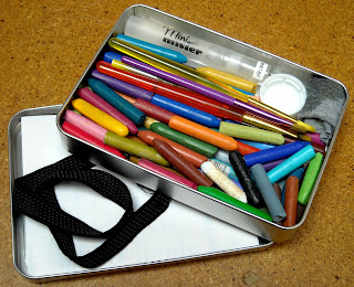
For the first three years of their lives, my Caran d'Ache sat in a neatly spectrumized row in their original tin, and then one day I needed to do a background, and the most efficient way to do it was by breaking a crayon  (gasp!) and using it on its side. I paused, thought about it, and then, ceremoniously, broke my first crayon. And then I broke them all, one after one. And I lived. I know that might sound weird, but I'm funny about keeping things pristine in the package, just in case, oh I don't know, I get audited by the Art Police or something (I didn't say it was logical). Two things happened after that ... every trip to Port Townsend and Akamai Arts led me to buying more Caran d'Ache, and I moved my little half-crayons to a lovely thin little tin (less prone to coming open and spilling and all that sort of un-Virgo stuff). But (and you saw this coming, didn't you?) one day, even broken in half, I'd bought so many new colours that they could no longer fit in the lovely little tin. Uh oh. I graduated to a larger tin, and the new tin had room for Other Stuff. This is the story of the Other Stuff, and how, at our last retreat, I discovered I might actually *like* watercolour painting, something which has mystified (and possibly terrified) me for years. 

So ... left to right in the photo ... elastic hairband (more about that later), Mini Mister, scribbles of Caran d'Ache on label backing sheet, bit of old t-shirt (don't tell Mr. B.), dollar store paintbrush (cut to fit in tin), pop bottle cap, the Caran d'Ache I scribbled with, and the traveling tin. Oh, and the artwork? More on that later. It's taken about a year to perfect this little traveling kit. All packed up it measures 6.5" x 4.5" by 1", and is in fact, an old Maya Road tin I got years ago, its contents long gone. I've never been one of those people who likes BIG containers of water when I paint ~ too many opportunities for tragedy to my mind (hmmm ... must be the Virgo thing again). I prefer pouring a little water from the Mini Mister into a pop bottle cap, and cleaning my brush on the t-shirt scrap, or (truth be told) on the back of my hand (I know, I know, I'm a symphony of contradictions). But then I've never been the kind of person who slathers on acres of acrylic paint either, which would require the large pot of water and the Big Brushes.

Finding out that certain label backing sheets make excellent palettes was another bonus. Oh yes, I know, it *sounds* logical, but I discovered that not all label backing sheets are equal. Some are so slick that you can't scribble the crayons on them and that's no good either. Also (and quite coincidentally), a standard label backing sheet folded (or cut) in quarters, neatly fits in the Maya tin, too. Double bonus. The elastic headband holds the whole tin together because heaven knows it was *no good* at keeping my hair in place when I wore it. I think I must have a spherical head. But that's a discussion for another day.


Here's everything packed up to go ... the bit of damp T-shirt is rolled and tucked away so the wet is well away from the water-soluble crayons and the now dry bottle cap and the mini mister make sure it stays that way. The label backing sheet has been wiped clean of any residue and is folded in quarters ready to lay on top of the crayons and the little brushes, and the elastic headband waits to wrap it all up. The headband goes around the tin twice by the way, which is perfect when I want to elastic the tin to my journal for traveling.
Well, that's about it ... unless you were hanging around to see the artwork, in which case ...

These are my first attempts at illustrating somebody else's words ... in this case, the song "Parkette" by Bob Snider. I could rave on here about Bob Snider for awhile, and you'd probably understand him better by listening to him, but he's amazingly elusive online, which fits somehow with his persona. My first encounter with him was years ago when I was volunteering on the Admin Committee at the Vancouver Folk Music Festival. A couple of us spent some time trying to track him down for a scheduled performance only to discover later that he'd been busking in the downtown eastside. I'm no musical expert, but I don't think I would describe his playing as dazzling or virtuoso. In fact, his style of playing and his banter are so warm and casual and understated that it's only about halfway through the song you realize your heart has been sucker-punched (in the best way possible) by his lyrics. "Parkette" is one of my favourite little nuggets of his work, a brief 1 minute and 40 seconds. The pages are not in order in my painting, in case you're wondering why it doesn't make sense ~ and I'm only show you half, since the final project will be printed back-to-back. When I say "printed" I'm being optimistic. I thought when I got inspired to paint his lyrics that it'd be an easy thing to contact him and get permission to create and print my little book, but as I say, he's darned elusive online, and I've yet to get through to someone who can ask him if it's cool with him that I've created this. But when I do get through, and if he gives the okay, there may be a minizine in the making. But, in the meantime, I've definitely gotten over my irrational fear of watercolours.

Monday, April 23, 2012

Working on a new set of twins ...

 I can't believe it's been almost a month since Artfest. I keep hoping I'll get time to post some Artfest stuff ... but time marches on, and art deadlines march right along with it.

Just at the moment I have two big projects in the works .. both with April 30th deadlines, which goes a long way to explaining my recent absence from blog-world.

Here are two little teasers on one of the projects: The Sketchbook Project (Limited Edition). The first thing I did when I got my blank sketchbook was take out *their* pages and replace them with some blueprints I've gathered from various sources. I knew from the beginning that I'd be working with my theme (The Science of Story,  cover as shown) by diagramming the writing process as it might be portrayed in a science textbook.

As usual I started with a massive amount of notes, ideas and scribblings that I hoped would turn into coherent pages when the time came. Well, the time has come and yep - all those notes are coming in *very* handy, and by the end of the week I should have all 16 (!) spreads finished. Here's one I finished this evening ... first I drew the circle's edge and lightly gessoed the circle. Then I divvied up the circle as a pie chart and wrote out some of the places where story ideas come from. By the way, I'm not claiming ANY scientific accuracy in any of the diagrams in the book ... I'm just having a little fun thinking about the Science of Story and what that textbook might look like.

As usual, I'm making two books at once so I'll have one to keep. I'll post more page spreads over the next little while ... and when the Science of Story is on it's way, maybe then I'll have time to show you what I did at Artfest ... till then, this'll have to do  ...


Monday, March 19, 2012

Whoosh! Say ... wasn't that a deadline?

This year's trades: Books, Mini-Zines, Buttons & Tags


Time tends to speed up as Artfest approaches, and this is especially true when it's time to make all those items to trade with other attending artists. I decided to make a variety of items since this'll be the last Artfest (insert moment of silence here).

The largest (and most collaborative!) trade item is the Book of Faces (top left). I posted an invite on the Artfest Yahoo group for people to send black and white line drawings of faces to add to my ongoing collection ~ an attempt to encourage myself to draw more faces. I'm pleased to say the finished book contains more than 150 drawings, as well as additional sections on tracing and clipart, as well as blank pages so people can continue to add their own faces.

Also included (by kind permission of Kathy Barbro) is a section I'm calling "Art Projects for (Big) Kids", which features some of the face-themed projects over on her Art Projects for Kids website. Her site  has *way* more than face-related art projects, and I highly encourage you to surf over and have a look, particularly if you have children or, what the heck, if you've ever been a child. The full-size version of my Book of Faces will be traded with people who submitted drawings, and I've made four mini-zine excerpts of the book (the blue covers along the right-hand side of the photo) to trade with other attendees. I'm so pleased with how they all turned out ~ and relieved to have them all done in time!

I'm also making some laminated luggage tags with some cool thread "dribbles" on the back. Mr B. wanted to know how exactly you "dribble" thread ...he insisted it's not really possible ... of course, when I showed him what I was doing, he agreed that dribbling was as good a word as any he could think of.

Artfest-wise, I'm also making some fun 1" buttons, as well as participating in the Artfest ATC book AND the 4x4 chunky book, but thank heavens all those bits and pieces were sent to their respective organizers long ago. I might even manage to get a few more ATCs made when all is said and done. Whoosh, indeed!

For any of you who've been to Artfest, I don't need to tell you how wonderful and rare an experience it is. So, here's a shout out to Lelainia for taking me to my first Artfest years ago, and bunches and bunches of appreciation for all the fabulous teachers and like-minded friends who've grown out of my Artfest connection. I know this last Artfest will be amazing and bittersweet and I plan to soak up every little bit of it ~ hence the overkill in my participation this year. I wish Teesha and Tracy and their whole gang all the best as they set their sails for other projects and artistic horizons.

Wednesday, February 22, 2012

Time Traveling Twins ...

As quoted from Wikipedia: "In physics, the twin paradox is a thought experiment in special relativity, in which a twin makes a journey into space in a high-speed rocket and returns home to find he has aged less than his identical twin who stayed on Earth."

You Are Here ...
In my case, these twins are books I created for the Sketchbook Project. And before you ask, Yes, it was twice as much work to make two, but given my personal rule ("Always Make Two") when it comes to artwork, I couldn't *not* make two.

Since the Sketchbook Project people encourage participants to be creative, to think outside the book if you will, the first thing I did was disassemble the book as supplied and create my own internal pages, as well as creating my own blank book to keep. The books are divided in three sections: (predictably) The Past, the Present and The Future. The Present is a single page, while the Past accordions out to the left, and The Future accordions out to the right, each filled with stuff I've thought about, written about and imagined about time travel, the passage of time and the effects of time on the human experience.

The Past  ... how far back do you want to go?
I've been reading Science Fiction since I was a kid, which wasn't really typical of girls where I grew up. I'd like to point out that I was reading Science Fiction, not Fantasy. As soon as a story introduced a Wizard, a Dwarf or Magic I was OUT OF THERE. I attribute this to reading Dune before Lord of the Rings .. in fact, I never got even made it through LotR, or any of its many brothers.

The Future ... how do you prepare for the unknown?
Anywho ... when I saw Time Travel as an option for a theme on the Sketchbook Project, I knew it was for me. I spent a few months re-reading my favourite SF books on the theme, and making notes and diagrams. I think I probably have enough material in my notes to *actually* time travel when the technology finally gets invented. I even attended a lecture on "The Art and Science of Time Travel" at the British Library while on vacation in London last summer. I was in heaven ... 5 fabulous panelists (including Audrey Niffennegger!), a packed audience (250+) and 2 hours of all the Time Travel you can handle ... one of the best nights of my life. I obviously need to get out more ...

PS ~ I've only shown you a bit of the final books here ... but the twin that's part of the Sketchbook Project's touring exhibit will also be digitized in their online library ... not sure how they're going to deal with the whole accordioning thing ... but, hey, they said be creative ... I assume they'll let me know when the images are online and I'll post the link here on my blog. Now ... off you go, into *your* futures ... :)

Friday, May 06, 2011

Bookish and loving it ...

I've always loved books. I can't remember when I learned to read ~ certainly it was before I went to school ~ probably at age four or so. I know this because I have vivid memories of being bored out of my mind tracing 8" high fuzzy ABC's with my index finger in Grade One, and being seriously annoyed when I realized we weren't going to be given any *real* books until after lunch, or maybe even later.

I claim no particular genius in reading so early, it was most likely due to the fact that in my early years I lived in what we called "the bush", i.e. smallish dwellings in deep forests far from town, and without the benefit of television or (that I can recall), even radio. There were only limited options for self-amusement: go outside and play (which at some times in the year might result in freezing to death), make art (still doing that ~ plus ca change!), help with housework (um ... ick), and reading. Reading seemed the most reasonable of these, since constant art-making was not on the cards due to the shocking absence of craft stores in the deep forest. Reading had the added advantage that I could learn about the Great World Beyond, where I would (and eventually did) go. Even in the smallest of our dwellings, there was always a corner designated: The Library. It might only be a bookcase, but to us it was a Library. I didn't actually get my own public library card till I was 13 or 14 I think. But that's another story and completely unrelated to my reading habits.

Anyone who's been to my house can attest to my ongoing love of books. I *do* have a library card now, but I seldom borrow books. But only because I can't bear to give them back. It's like I form a bond with them ... a contract ... that having read them once, I will read them again, and again, and how can I do that if someone else has them? No ... better to buy them outright. Well, at least until you run into the problem we currently have - no more wall space for more bookcases. Sigh.

Meanwhile, back to the book that inspired this ramble ... or, why have I put a picture of Jonathan Safran Foer's book Tree of Codes here for you to see? I can't claim to have read it. I'm not sure if it's good. But it's definitely interesting. A book after my own heart. In order to find out why, I offer the following videos: public reactions, how it was made and Jonathan says.

In "how it was made" I was particularly touched by a scene midway (2:42) showing pages being hand-collated, a process I've been intimately involved with since I was 18 and continuing up to the present day. Oh, and the cutter shown at 2:33? I know my way around that, too. Granted, I spend much more time nowadays at a desk interacting with a computer (who doesn't?), but if push comes to shove (which it sometimes does), I can cut, collate and bind if needed. Maybe not on as grand a scale as the video, but hey - we can't all be big publishing houses, can we?

The video portrays my very familiar world in an almost romantic way ... the snow of little diecuts falling from the sky ... the tenderness of little suction cups feeding sheets into the press ... the lush musical score. And for all the times that I really really really do not want to go to work (constant art-making is much more fun), there is an ordered beauty to the printing process that makes me really happy too. And I wanted to share it with you.

Monday, February 14, 2011

What I'm up to ...

Yeah, I know, two posts in one day, what am I thinking?

I was updating the long column of stuff to the left of my posts, and suddenly realized that probably not many people read that far down, so I thought I'd post it here as well ...


READING: Arcadian Adventures with the Idle Rich
by Stephen Leacock. Written in 1914, a very funny satire of the upper crust of the American nouveau riche at the turn of the previous century in an unnamed but very New York-ish metropolis. At one time considered to be a better read than his classic Sunshine Sketches of a Little Town, and I can see why. But then I grew up in small towns, so I already knew their foibles. The foibles of the rich are infinitely more exotic.

WATCHING: Documentaries on TV. Have also recently re-watched Nick & Norah's Infinite Playlist, The Time Traveler's Wife and Frequently Asked Questions About Time Travel, all while working in the studio, so not *really* watching, more like listening while I work.

LISTENING TO: NPR online archives, especially Wait! Wait! Don't Tell Me! I think they should do a show featuring the answering machine messages that Carl Kassell makes for the people who win their phone quizzes. Also digging the latest Radio Lab releases.

DOING: Mini-zines, Collaboratives & Tidying Up: I'm still making mini-zines once a month for a swapbot series. I recently launched a fabric collaborative book on the theme of Winter Trees (not due till May). I'm 2/3 of the way through 3 heart-themed exchanges hosted by other people. Prepping for Artfest (what oh what to make for trades!?), and I'm trying the take advantage of the slowdown at work to make some sense of the piles of stuff I call my studio.

ENJOYING: Links my brother sends me: What can I say? He knows my quirky tastes and sends me fun stuff to look at, here are a few that I've really enjoyed lately ...

- Animation of the human body as a machine
- Carl Sagan versus Astronomy
- How birds might use quantum entanglement to sense Earth's magnetic fields - okay, I see you out there doubting that this might be something I was already interested in, but I was just listening the other day to TWO documentaries about this ... one on how carrier pigeons find their way, even when they're blindfolded and driven hundreds of miles from "home", and another on magnetic pole reversal (did you know that the magnetic north pole wanders all over the north?) and how a reversal of the magnetic poles might affect bird migration.

And (since I was posting anyway) the pic is another of the hearts I monoprinted yesterday. This one will probably get stitching and mica buttons added to it.

Okay that's probably enough for today .... now it's back to tidying for me!

Wednesday, August 04, 2010

A night at the CBC with A.M. Smith


Just home from a wonderful evening at the CBC (that's the MotherCorp, the Canadian Broadcasting Company for those of you NOT North of the 49th). I was lucky enough to be invited to a North by Northwest taping of Alexander McCall Smith. If you're familiar with the No. 1 Ladies' Detective Agency, 44 Scotland Street and (my personal favourite) the Portuguese Irregular Verbs Series, you'll know his name already and may even be knee deep in at least one of his ongoing series of books.

He's just launched another series, beginning with Corduroy Mansions, which includes (as well as many human characters) a vegetarian Pimlico terrier named Freddie de la Hay. Mr. Smith has written something like 70 books, although he claims that some of them are childrens' books and therefore shouldn't count, even though they do have covers and page numbers. He claims to write between 4 and 5 books a year (I believe it - he is hard to keep up with!), and says it's not so much that he sits down to write, it's as if his characters go on living when he's off writing other things, and then he sits down one day and asks what they've been up to while he's been gone.

Amongst the interesting facts he revealed this evening ... that he's just in the last day or so begun the next in the No. 1 Ladies' Detective Series (a lot of which he says he writes when he stays here in Vancouver, where his sister lives), that he has an inordinate fondness for a musical group called Kenny Young and the Eggplants, and that he can't possibly explain why 97% of his readers are women, except that perhaps the men who read him still haven't come out to their friends and families.

I was expecting a Scottish accent of some sort, but he sounded decidedly English to me (and I should know, having cohabited with one for more than 20 years now). He was terribly funny, but in that dry, understated way the Brits are famous for. Although at one point he nearly joined the audience in a fit of gleeful giggles while reading a particularly amusing passage from Corduroy Mansions. He seemed genuinely and shyly pleased by the attention, applause and laughter from the audience. He very kindly stayed afterward to sign books for (and take pictures with) anyone so inclined. My face hurts from smiling - and that's always a good thing.

P.S. As well as a future podcast, the interview will be aired on CBC AM the next two Saturdays from 8 am to 9 am (PST) on North by Northwest. Go here for more details, and if you hear someone laughing while you listen ... well, yes, that was me.

And another P.S. - Mr. Smith mentioned that he's been serializing several of his books online lately, and indeed if you go here you can hear Andrew Sachs (AKA Manuel of Fawlty Towers fame) reading the next book in the Corduroy Mansions series: The Dog Who Came in From the Cold.